Why Your App's Onboarding Is Losing You Half Your Users Before They See the Value
Most apps lose the majority of new users before those users ever experience the core value. The first three minutes are the most important and most misunderstood part of any product. Here's what breaks onboarding and how to fix it.
Day 1 retention for most mobile apps sits between 25% and 40%. That means before a user has had a full day to decide whether they want your app, more than half of them are already gone.
The first session is the most important product interaction you'll ever have with a user. Most indie apps treat it as an afterthought — a checklist of permissions and account creation steps before the user can do anything. That's the problem.
The Common Mistakes
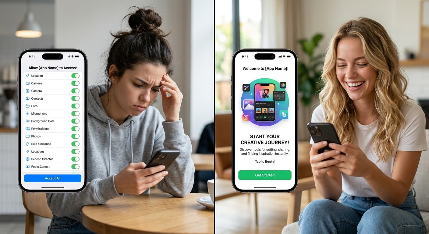
Asking for permissions before demonstrating value. This is the most common onboarding mistake and the one with the most direct impact on drop-off. A user who just installed your app doesn't trust you yet. Hitting them with a push notification permission request, a location request, or a microphone access prompt before they've done anything in the app forces them to make a privacy decision without any context for why they should say yes.
The permission grant rate for any given permission is directly correlated with whether the user understands why they're being asked. "Allow [App] to access your location" asked on screen 1 of onboarding gets denied most of the time. The same prompt, shown after the user has experienced a feature where location clearly matters, gets granted most of the time. Delay every permission ask until the last possible moment before it's needed for a feature the user is actively trying to use.
Too many screens before the user can do anything. Every screen between install and the user's first meaningful interaction in your app is friction. Onboarding carousels that explain features, welcome animations that take 3 seconds to play, value proposition screens that describe what the app does — these are all friction that the user didn't ask for. They came to use the app. Let them.
The benchmark: a new user should be able to do the core thing your app does within 60 seconds of installing it. If they can't, your onboarding is too long.
The tutorial that teaches features instead of outcomes. "Tap the + button to create a new item. Swipe left to delete. Long press to reorder." This teaches the user how the interface works. What it doesn't teach is why they'd want to do any of those things. Users don't want to know how to use your interface — they want to accomplish the thing they downloaded the app to do. Onboarding that leads with outcomes ("Here's how to [achieve goal]") instead of interface mechanics retains more users through the first session.
Requiring account creation before value delivery. If a user has to create an account and verify their email before they can see what your app does, you're asking them to commit before you've given them a reason to. The apps that solve this well offer a "try it first" or "explore without an account" path, and then prompt for account creation after the user has experienced enough value to have a reason to save it.
What Good Onboarding Looks Like
The goal of onboarding is to get the user to the "aha moment" — the point where they understand what your app does for them specifically and why they should keep using it — as fast as possible. Everything else is a distraction from that goal.
Concrete application: map out your current onboarding flow and mark every screen that isn't directly necessary for the user to reach their first successful use of the core feature. Those screens are candidates for removal or deferral. Permission screens can almost always be deferred. Account creation can almost always be deferred. Feature tours can almost always be replaced with contextual tooltips that appear on first use.
Show the destination, not the map. The most effective onboarding screens show users what they'll have when they're done, not step-by-step instructions for getting there. A screenshot or animation of the app in a useful state, with a single clear CTA to get started, outperforms a 4-screen feature walkthrough almost every time.
What We Changed at XenneX
Our original onboarding flow had 5 screens before the user could do anything: welcome screen, value proposition carousel (3 slides), and account creation. We were losing more than 60% of users before they ever reached the core experience.
We cut it to one screen — a single prompt that gets the user into the app's main interface immediately, with account creation deferred to when they first try to save something. Day 1 retention went up. The users who did create accounts were higher-intent because they'd already experienced the value and were choosing to commit to it.
The permission prompts moved to their natural moments: notification permission asked after the user completes their first task and sees the obvious benefit of being reminded, not before they've done anything.
The change wasn't technically complex. It was a product decision to stop optimizing the onboarding flow for our data collection needs and start optimizing it for the user's first experience.
That's the right order of operations.
Working on something like this? See how XenneX works with clients or what XenneX has built.
Keep reading
- Designing for Users Who Can't Read YetMy next app is for kids as young as two. No text, no menus, no settings. Building it has meant unlearning most of what I know about interface design.
- What Twelve Years of Naming Things Has Taught MeXenneX. Redinfinite. Dealery. Game Night. Some of those names came fast. Some went through embarrassing intermediate versions nobody will ever see again unless I tell you about them. Here's what I've actually learned.
- Five Things I'd Build Differently If I Started XenneX TodayEighteen months in, the decisions that seemed right at the start look different from the other side. Here's what I'd change — not to relitigate the past, but because these are the things I'd tell anyone starting something new right now.