Wimbledon Is a Design Masterclass. Here's What Indie Devs Can Learn From It.
Wimbledon hasn't changed its visual identity in 140 years. White clothing, grass courts, dark green and purple — it's the same. Indie devs who keep refreshing their app's visual identity every 18 months could learn something from that.
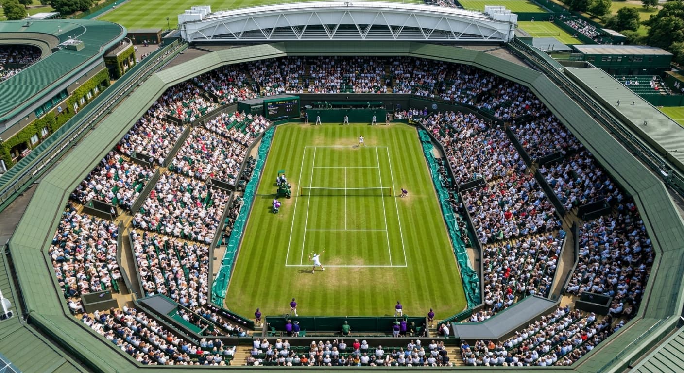
Wimbledon opens Monday. And every year, without fail, it looks exactly like it did last year. White clothing. Grass courts. Dark green and purple branding. The Championships logo that hasn't meaningfully changed in decades.
In a world where brands refresh every few years and apps redesign every major version, Wimbledon is doing something almost no one else does: refusing to change what's working.
There's a product lesson in that.
Your Users Don't Get Tired of Your Brand — You Do
The itch to redesign usually comes from inside the building. You've looked at your app icon ten thousand times. Your color palette feels stale to you. You've read enough design Substacks to have opinions about whether your typography is "contemporary." So you start talking about a refresh.
Here's what's almost certainly true: your users are not experiencing this. They tapped your icon this morning because they know it. It's associated with a thing they do regularly. The icon is a signal — a learned one — and changing it resets that signal.
Wimbledon doesn't care that the white clothing rule feels dated to people who've been watching for 30 years. The rule is part of what Wimbledon is. Wimbledon with colorful kit is a different tournament — it might even be a better tournament on some objective metric — but it's not Wimbledon.
Your users feel the same way about your app's identity, even if they can't articulate it.
Constraints Create Identity
The white clothing rule started as a hygiene thing in the Victorian era. It persisted because it became distinctive. Nobody else has the rule. The constraint that seems limiting is actually the thing that makes the brand immediately recognizable at a glance.
The most distinctive indie apps have constraints like this — usually visual ones. A specific color that nobody else uses in that category. An icon treatment that's immediately identifiable. A type choice that feels intentional rather than default.
These constraints aren't limiting. They're load-bearing. The app looks like itself, consistently, across every context — App Store listing, home screen, notification badge, marketing material. That consistency compounds into recognition.
The temptation is to treat those constraints as something to escape in the next version. The better instinct is to reinforce them.
The Exception: Functional Change vs. Aesthetic Refresh
Wimbledon switched to yellow tennis balls in 1986 — different from the traditional white balls — specifically because yellow read better on television. It was a functional change driven by a new context (broadcast), not an aesthetic preference.
That's the right frame for when to change something visual in your product: does this serve a function that the current design can't? Not: does this feel fresh? Not: is this more contemporary? Not: do I like this better?
If your icon is genuinely unreadable at small sizes, fix the icon. If your color palette fails accessibility standards, fix the palette. If your typography is illegible on current screen densities, fix the typography. Those are functional changes.
If you're changing things because you've been looking at them for two years and you're bored, that's not a functional change. That's Wimbledon deciding to try clay courts because grass is "over."
What This Looks Like in Practice
The strongest version of this for an indie app: pick your visual identity deliberately, document the constraints explicitly (this color, this type treatment, this icon grid), and then treat those constraints as fixed for longer than feels comfortable.
When you're tempted to change something, ask: is this serving a user? Or is this serving me?
Wimbledon has been asking that question for 140 years. The answer is almost always: don't change anything.
Wimbledon starts Monday. It will look exactly like last year. That's the point.
Working on something like this? See how XenneX works with clients or what XenneX has built.
Keep reading
- Designing for Users Who Can't Read YetMy next app is for kids as young as two. No text, no menus, no settings. Building it has meant unlearning most of what I know about interface design.
- What Twelve Years of Naming Things Has Taught MeXenneX. Redinfinite. Dealery. Game Night. Some of those names came fast. Some went through embarrassing intermediate versions nobody will ever see again unless I tell you about them. Here's what I've actually learned.
- Why Your App's Onboarding Is Losing You Half Your Users Before They See the ValueMost apps lose the majority of new users before those users ever experience the core value. The first three minutes are the most important and most misunderstood part of any product. Here's what breaks onboarding and how to fix it.