Designing for Users Who Can't Read Yet
My next app is for kids as young as two. No text, no menus, no settings. Building it has meant unlearning most of what I know about interface design.
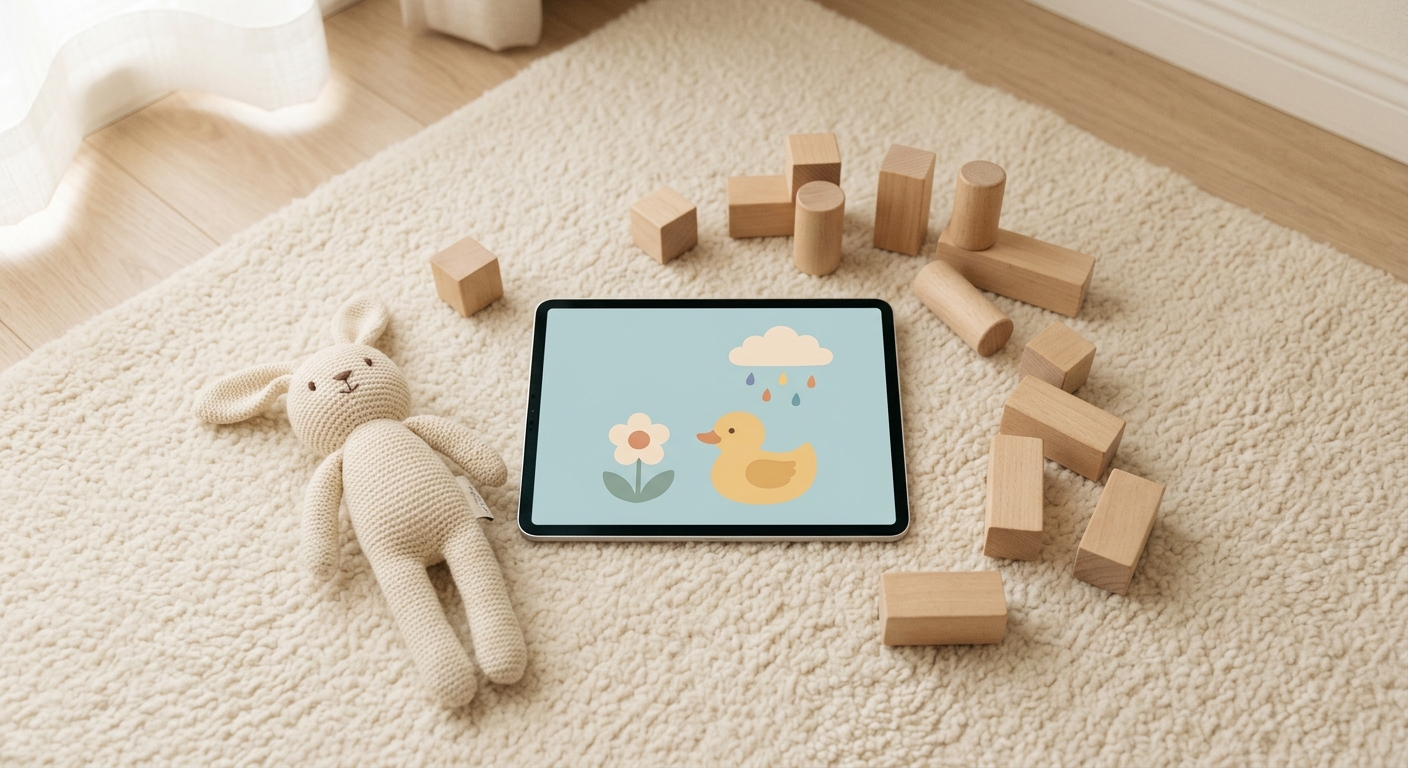
Every interface I've built in the last decade has leaned on words. Button labels, menu items, error messages, onboarding screens, a settings page full of toggles with a sentence under each one. Even when I thought I was designing visually, the text was doing most of the work.
My next product doesn't get to do that. It's called PlaySori, a set of calm, open-ended digital toys for young kids, coming to iPad, iPhone, and Android late this year. The youngest kids I'm building for are around two. They can't read a label, and they don't know what a menu is. That's forced me to rethink almost every UI habit I have.
No Text Means No Text
The rule I started with is simple: no words anywhere in the app. Not on buttons, not on signs inside a toy, not on the spine of a tiny book sitting on a shelf in the background. If something needs to communicate, it uses a picture, a motion, or a sound.
That rule is harder to keep than it sounds. Text is the easy fix for every unclear moment in an interface. Not sure a button is obvious? Add a label. Not sure someone will find a feature? Add a hint. Take that away and every unclear moment becomes a design problem you actually have to solve.
I've loosened it in exactly one place. Numbers can show up when they're part of the play itself, like a counter that ticks up as you keep something bouncing. Even a kid who can't count yet gets that a number going up means something good is happening. Everywhere else, the rule holds.
A nice side effect: an app with no text works the same in every language, with nothing to translate.
Sound Does the Job Text Used To
If kids can't read the interface, they have to hear it. Every tap, drag, and drop in PlaySori makes a sound, and the sound is the feedback. It's how a kid knows something happened, and it's often the reason they tap again.
Sound is also the heart of the name. "Sori" means "sound" in Korean, and the toys are built around it: layering noises into a song, things that splash and squeak and hum.
Two lessons came out of this quickly. First, one sound per action gets old fast. A kid will tap the same duck 40 times in a row, and the 40th tap shouldn't sound exactly like the first, so each interaction gets several variations. Second, made-up gibberish voices are a missed chance. When the toys name things out loud, they use real words, so a kid tapping a duck actually hears "duck."
Nothing to Win, Nothing to Fail
Most apps are built around goals: finish the task, complete the level, hit the streak. For a two-year-old, that framing doesn't make sense, and failure states are worse. A red X or a sad sound means nothing to a toddler except that the toy stopped being fun.
So there aren't any. No scores, no levels, no wrong answers. Each toy is a toy in the literal sense: you poke at it, it responds, and you decide what's fun. Designing that way means every interaction has to be satisfying on its own, because there's no goal to carry you past a boring one.
Even "You're Out of Time" Needs a Design
PlaySori is free to try with no signup. The whole playroom is open for three days, and after that there are 15 minutes of free play a day. That raises a question I'd never had to think about before: how do you tell a toddler their time is up?
A lock screen or a paywall is a crying-kid moment waiting to happen. Instead, when the free time runs out, the toys get sleepy, yawn, and go to bed. The lights go down. It reads as a natural stopping point instead of something being taken away, and it gives parents an easy line: the toys are sleeping, we'll play tomorrow.
The Only Screen Built for Grown-Ups
There are no accounts, no profiles, and no parent dashboard. The one screen meant for an adult is the one where you buy the full version, and it sits behind a parental gate: a short check that's easy for a grown-up and hard for a small kid to stumble through.
That keeps things simple on both sides. The kid gets a playroom with nothing in it that isn't for them. The parent gets one place to deal with money, and nothing else to manage.
What It's Teaching Me
Building for users who can't read has made me notice how much my other products lean on words to cover for unclear design. A label on a button is often a sign the button isn't obvious enough. A tooltip is often an apology. I don't think every product should drop text, but it's a good exercise to ask, for any screen: if the words disappeared, would it still make sense?
For PlaySori, it has to. For everything else I build, it's turning into a pretty good test.
PlaySori launches late 2026. If you have little ones at home, you can join the waitlist at playsori.com.